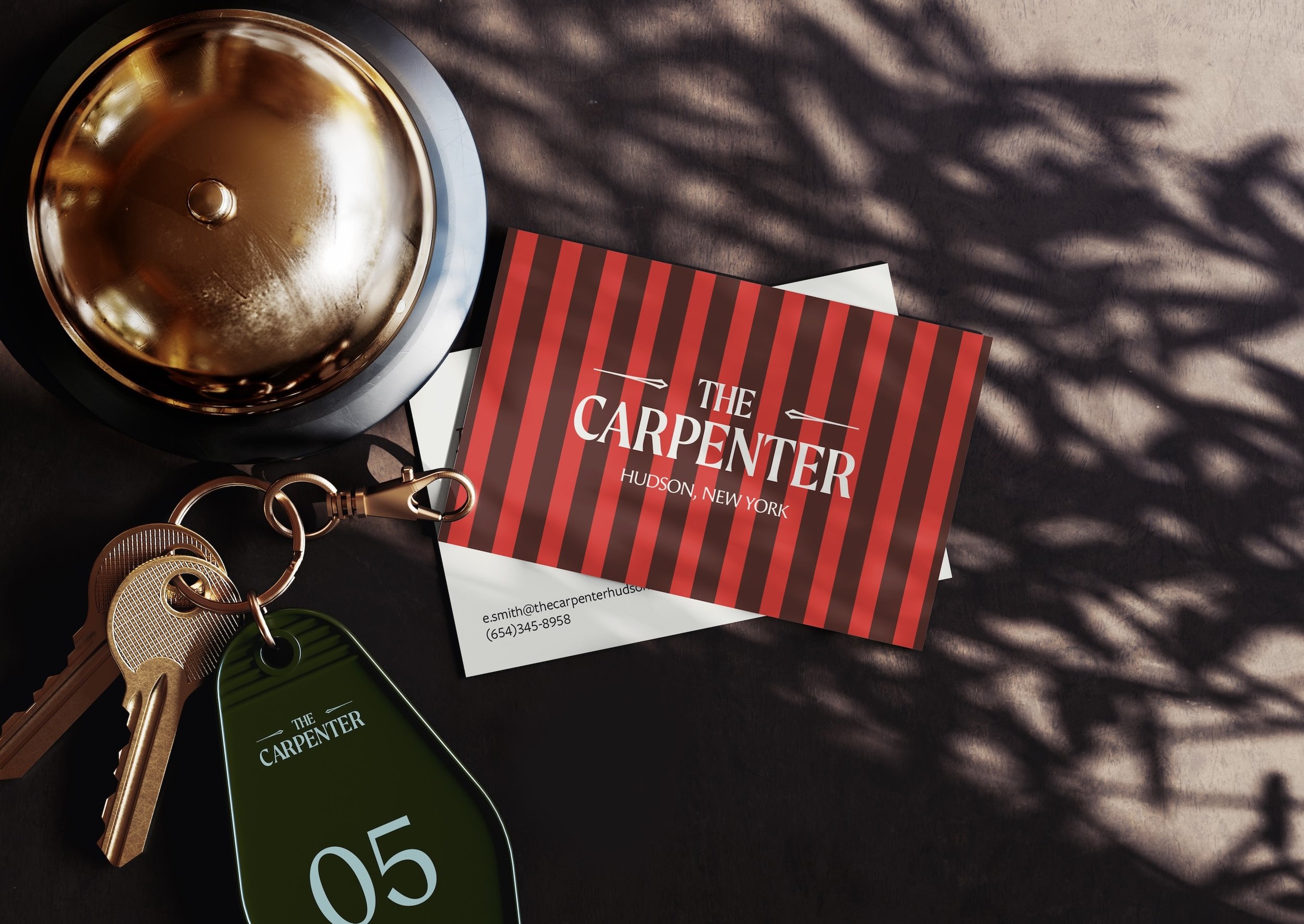
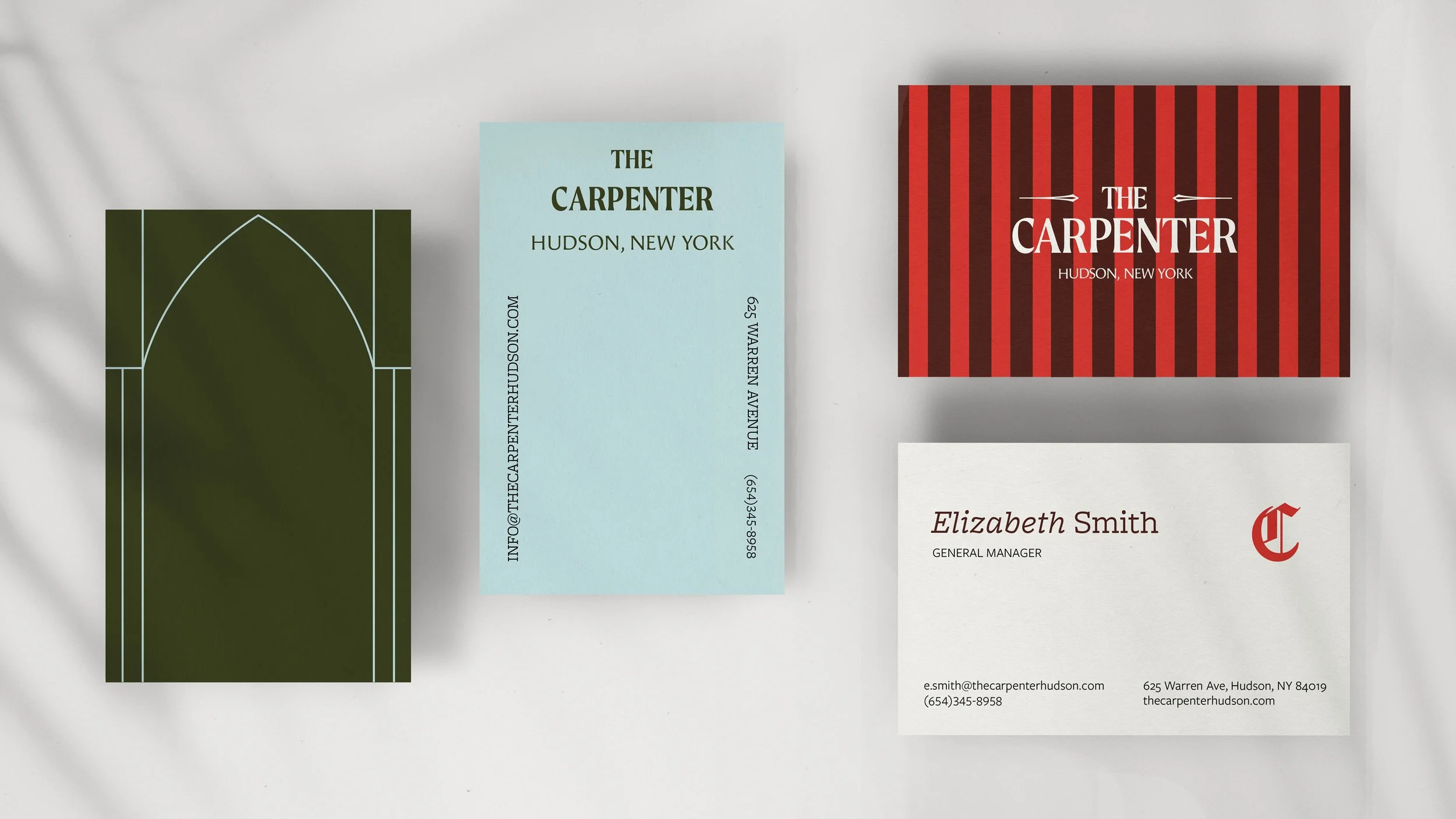
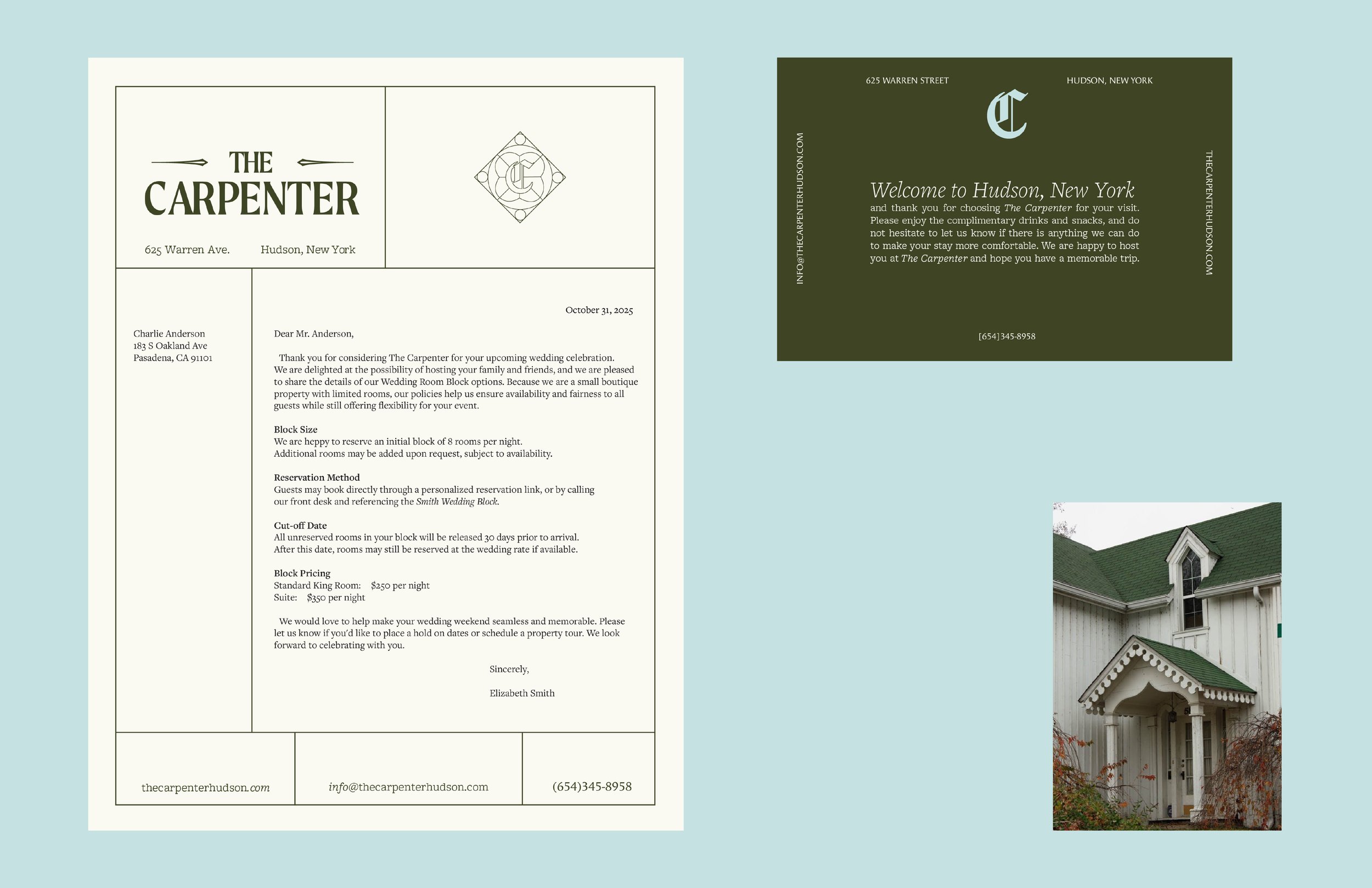
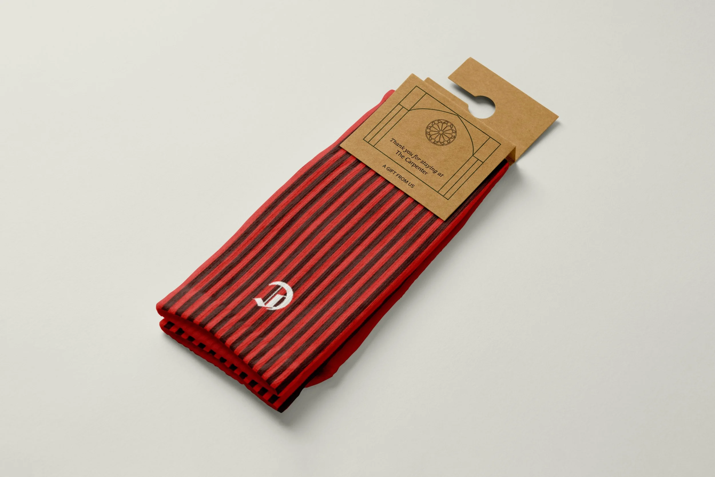
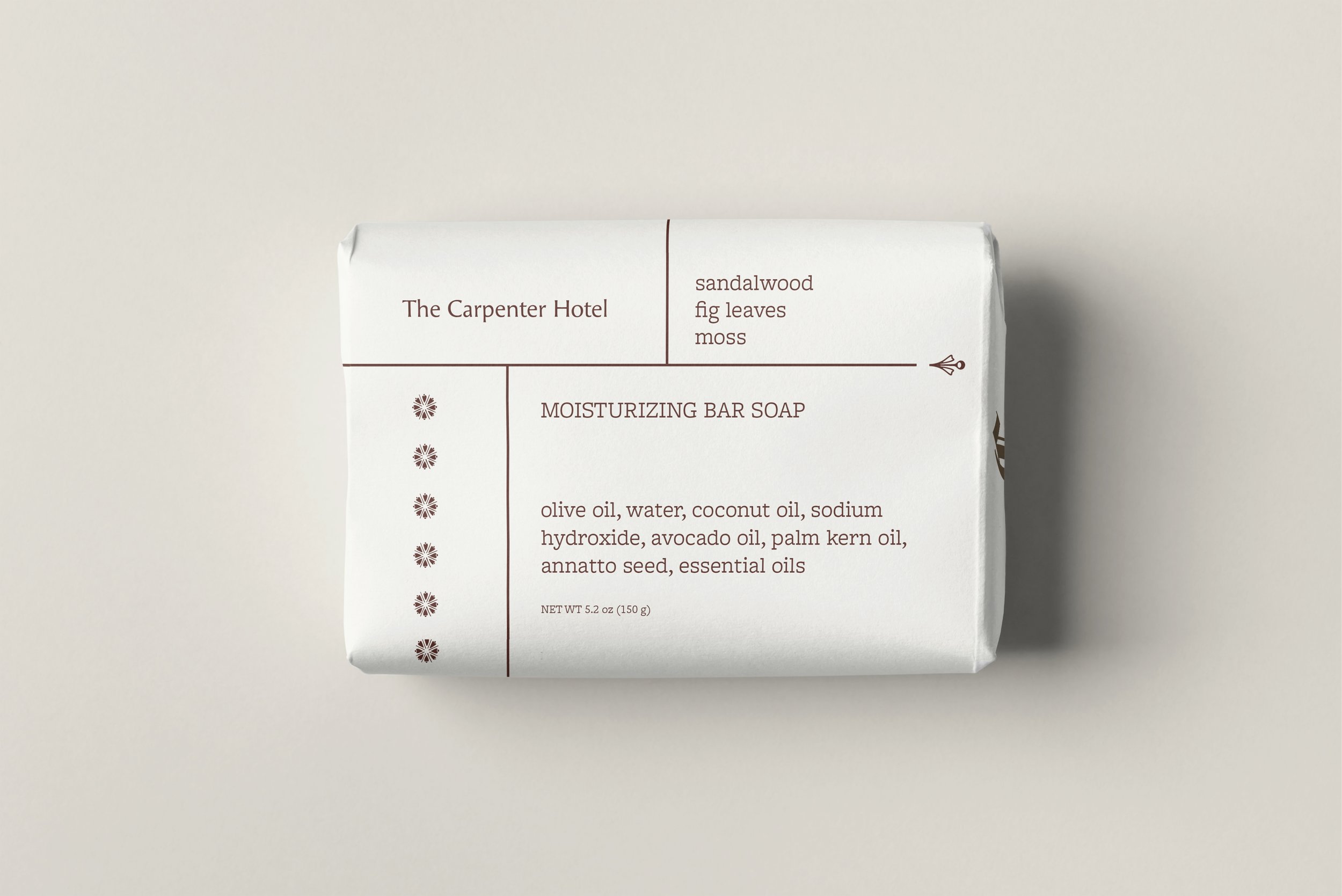
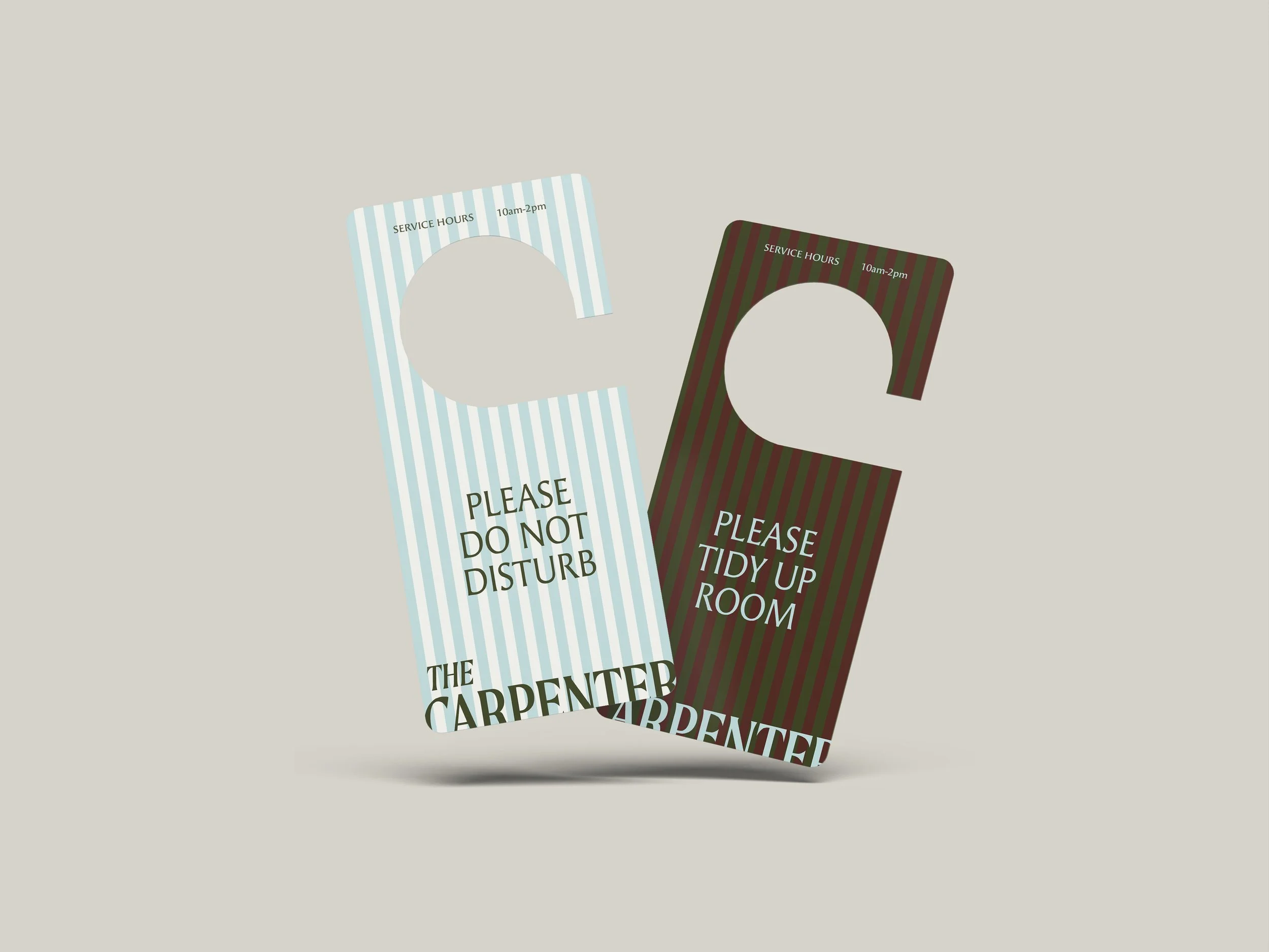
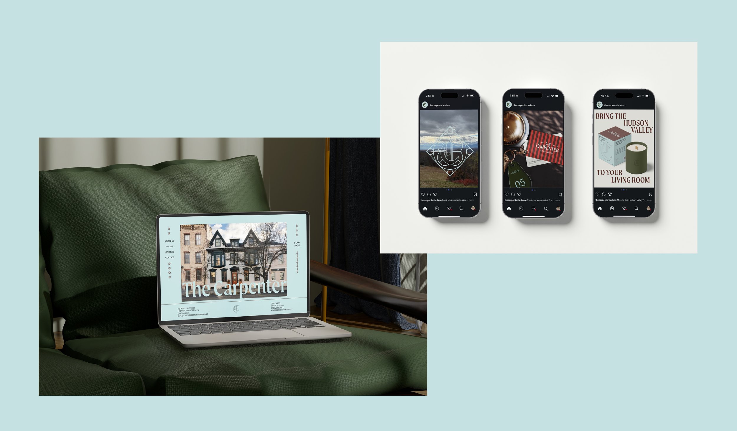
The Carpenter Hotel
BRANDING / VISUAL IDENTITY / STATIONARY SYSTEM / PACKAGING
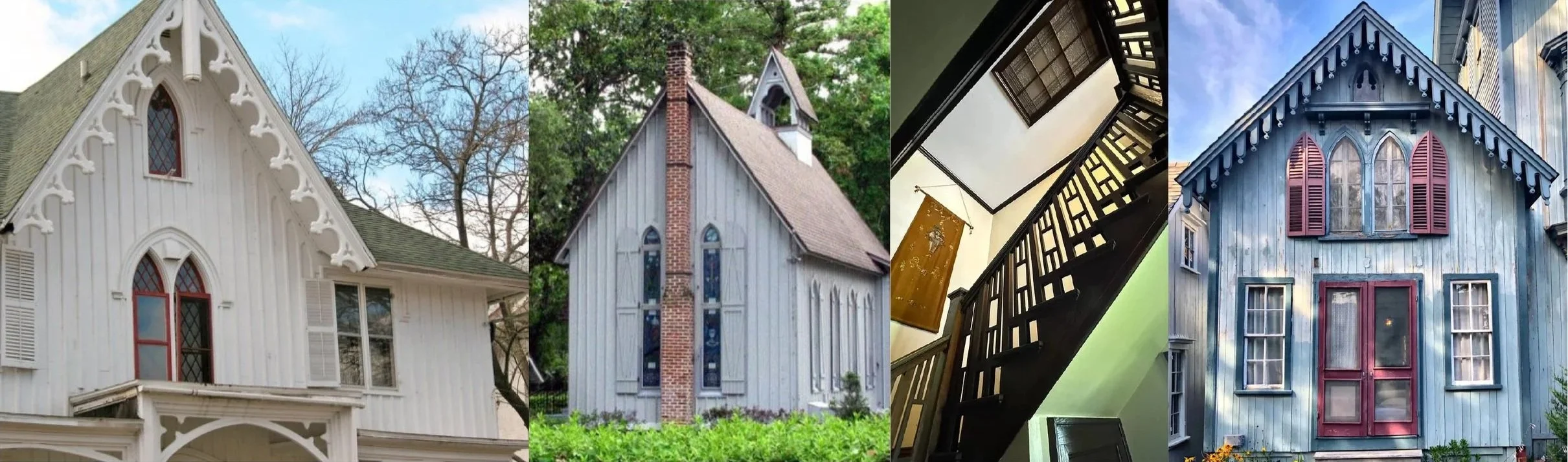
The Carpenter is a boutique hotel in the Hudson Valley that draws design inspiration from the region’s historic architecture, including Gothic Revival, Carpenter Gothic, and Dutch farmhouse styles. Its branding reflects a vintage aesthetic with a fresh approach, incorporating creative typography, decorative patterns, and structural graphics.
Connected to the hotel, Trellis Coffee extends The Carpenter’s geometric design foundation into a softer, more organic direction. Conceived as a garden-inspired café with an outdoor dining atmosphere, it introduces brighter color, calligraphic typography, and floral imagery, creating a complementary contrast that feels both integrated and distinctly its own.

Architectural elements such as board-and-batten siding, ornamental carvings, and high pointed arches are echoed throughout The Carpenter’s graphics and printed materials. Typefaces featuring flared stroke endings and tall x-heights reference the craftsmanship of historical sign painting while emphasizing a strong sense of verticality.